Each time I offer Gov 2080 (“Quantitative Analysis in Political Science”), I work with students in the class to design and field a poll of Bowdoin students. We pay careful attention to question wording and order, and we use the data to analyze the relationships between variables.
This year’s results are here.
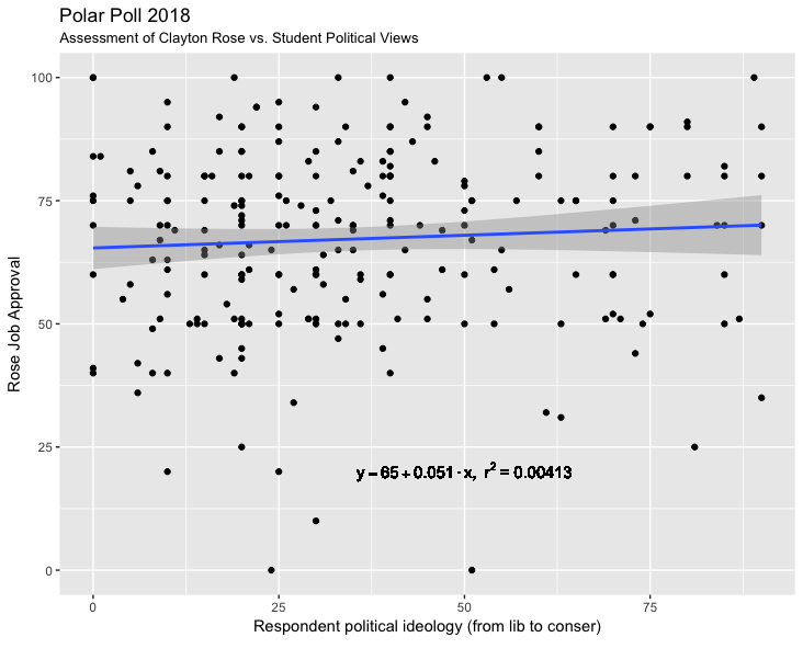
We can have lots of fun playing around with the data. For example, here is one example. The graph below shows the relationship between students’ assessment of Clayton Rose (President of Bowdoin) against their own expressed political views. Both scales are from 0 to 100, with higher numbers on the vertical axis being stronger approval of Rose, and higher numbers on the horizontal axis being more conservative political views.
The relationship is flat. I would assume that Rose would like these results. He is widely popular across the student body, which is an important outcome in an environment where campus politics in lots of places is charged and tense.
More results to come as we analyze the data.