I’m showing here some more analysis of results from my “Polar Poll” of Bowdoin students. I re-surveyed students last week, asking those who completed a survey in March to indicate their stress levels in the last 6 weeks. This allows us to look at changes in stress levels from before and after Spring Break. I’m interested in those breakdowns by students’ self-reported financial aid status and class year.
Class year by date is the first graph below.
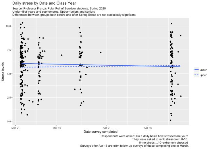
First-years and sophomores had slightly higher stress levels in early March compared to juniors and seniors, though mean values in each group were not statistically different from each other (p-value = 0.103). Stress levels are basically flat, though up slightly for juniors/seniors in recent weeks.
Breakdowns by financial aid status are next, and here too, we see little difference between groups or over time. Mean stress levels are consistently just a tad below 6 on the 0-10 scale.

Lots of reasons would lead us to think stress levels could be up for students (e.g., sickness, distance from friends, pressures at home, broader uncertainty), but there are also reasons to think stress could be lower (e.g., the safety of home, switch to credit/no credit). And so we might expect those to cancel out. Still, differences among students might suggest the pattern would vary when comparing more well-off students with those from lower and middle income families; or between those nearing graduation and those just beginning their Bowdoin experience. We see little of that here, though. Bowdoin students are no more or less stressed these days, it seems.
[Note: Surveys after April 15 are not a panel, such that these are not within-student comparisons but cross-sectional ones. I resent the survey to everyone who took it in March. Response bias in April could skew the results. Still, financial aid breakdowns in the March and April pools are identical and match College data on the broader population. Breakdowns by upper/under in the March and April pools are also virtually the same, but both data sets have disproportionately more first years/sophomores (54%) than the underlying population (50%).]
